
Investor mobile dashboard
2025 · Senior Designer
A premium investment brokerage — not a mass-market one. Clients arrive by referral and stay for decades, each has a dedicated advisor, and a trader can execute an order on their behalf. The product is the client’s mobile dashboard. The company name and part of the details are withheld under NDA.
The brief
There are two kinds of conversation with an advisor. One is about strategy, risk and tax outcomes — that is the service people pay for. The other is lookup: “what’s my balance”, “why is my return negative”, “did the dividends land”. The second kind eats the time of the most expensive person in the company and creates value for nobody.
So the brief I worked to: take the lookup work off the advisor without touching the substantive part. Measured by three things — share of lookup requests, share of orders signed in the app without a voice confirmation, and weekly return rate. The numbers are under NDA.
The hypothesis
A dashboard answers “how much”. The question an owner of capital actually asks is different: “why that much”, and “what can I still do before year end”. As long as the app shows a total and says nothing about where it came from, every follow-up turns into a message — and people learn to start there instead.
So the work isn’t simplification, it’s explainability. Which leads to an uncomfortable conclusion for mobile design: density is not a flaw here. Clients open the app to check themselves, not to admire a big number, and every detail removed for the sake of a clean screen is one more reason to pick up the phone. Density is handled in layers: one large figure per screen, everything else grouped and opened on tap.
Screens
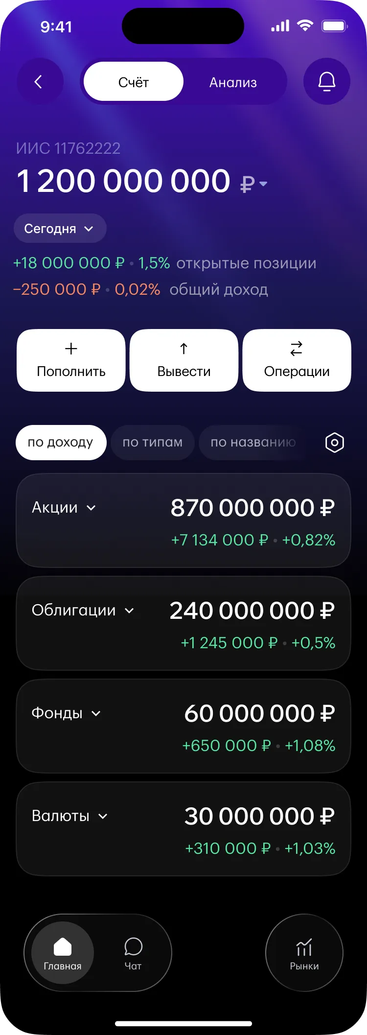
Portfolio value on top with a period switch, below it the result on open positions and total return. Green and red side by side: the minus isn’t collapsed behind a toggle — in a product people hold for decades, trust beats a pleasant first impression.
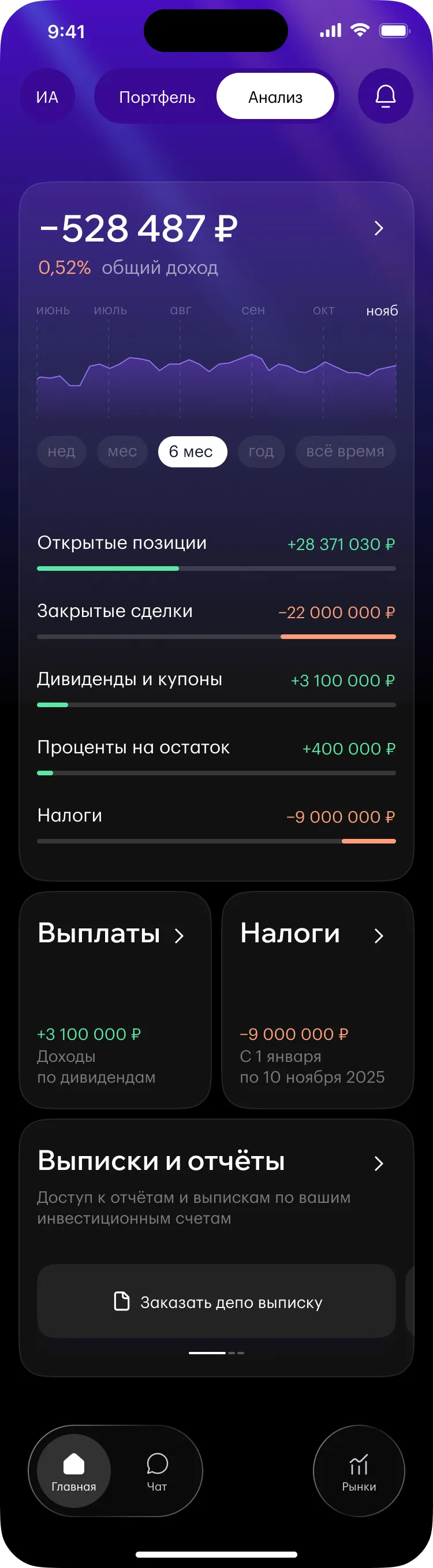
There’s no large chart on the first screen, even though almost everyone has one. A six-month line answers “how much” and “which way it moved”, but not “why that much” — and it takes the most valuable space on the screen. The chart moved to Analysis, where it sits next to the income breakdown and finally means something.
Then the feed: placements, management meetings, podcasts. There was no tab left for research — the chat took that slot in the bottom navigation. A deliberate trade: the feed is seen on every visit, a tab only when someone goes looking for it.
Below that, the order card with a Sign button. Normally this lives in a documents section — so the person who just discussed a purchase with their trader goes hunting for it in a list of paperwork. And the signature is mobile anyway, bound to that specific phone: the cryptography already happens in the device the person is holding.
Three tabs at the bottom: Home, Chat, Markets. Chat here isn’t support — it’s how an order gets executed. The tab bar is the scarcest real estate in a mobile app, but if a company has spent decades building its service around a human being, and the interface buries that human three levels deep, the interface contradicts the business model.
Positions are grouped by class: equities, bonds, funds, currencies. Each group carries its value and return, and expands on tap. When there are hundreds of holdings a flat list is useless — people look at the shape of the portfolio first and at a specific ticker second.
Sorting sits in its own row at the top. Top up, Withdraw and Transactions carry equal weight — at account level they genuinely are equal, and promoting one would be imposing a scenario.

The core of the project and a direct answer to the hypothesis. Return is broken down by source: open positions, closed trades, dividends and coupons, interest on cash, taxes. Each row carries a bar showing its contribution — so you see the weight, not just the amount.
Total return can go negative while unrealised gains are growing: one large trade closed at a loss plus taxes on earlier profitable periods is enough. A single total in that situation reads as a reason to make an anxious call. Broken down, it explains itself — and the conversation with the advisor starts at “what should we do” instead of “what happened”.
Taxes get their own card with the period on it. In investing, tax isn’t after-the-fact reporting — it’s a parameter you can still change before the period closes. That earns it a place in plain sight rather than in a documents section.
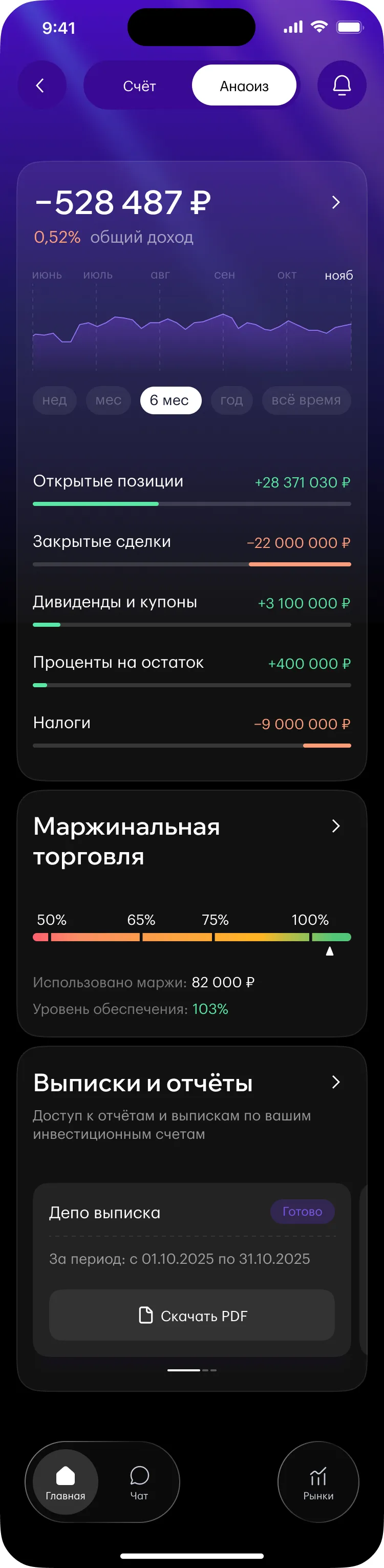
Analysis lives at two levels: the whole portfolio and a single account. The structure is deliberately identical — chart, income breakdown, statements. Only the scope changes; nobody has to learn to read the screen twice.
At account level margin trading is added: a collateral-level scale with a marker for the current position. It’s the one place where colour demands an action rather than reporting a result — red on a loss says “this happened”, red on this scale says “do something, or your positions get closed for you”.
A custody statement is requested with a button and appears in the same block with a Ready status and its period. Not by email, not on the website: the request and the result live together, otherwise people don’t know where to look.
This project is under NDA. The company name, the original brief, research materials and outcome metrics are not disclosed, so this case study covers the reasoning rather than the numbers. All data shown on screens is dummy data.